Exhibit 1
Before After
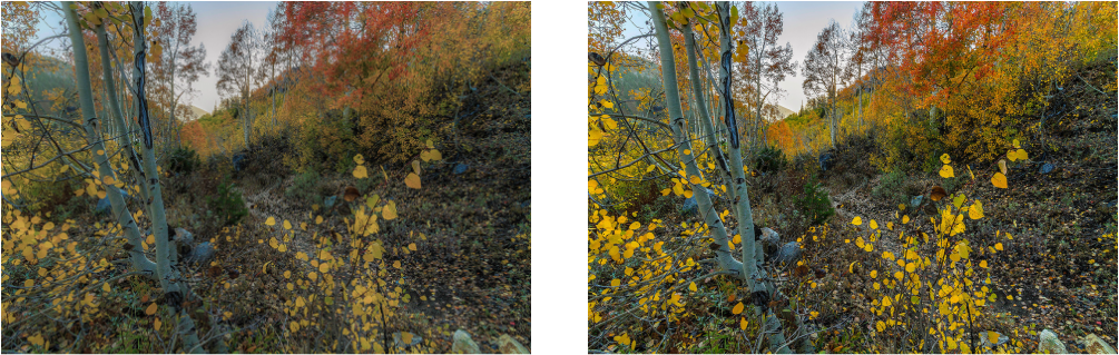
This is my image of autumn in Logan Canyon. In Camera Raw I first adjusted the exposure and then adjusted the blacks and whites. I decided to make the colors stand out more by making them more saturated,such as the oranges and the yellows. I sharpened the image as well and overall I am pleased with the end result.
- Contrast: The tree was place there for contrast with the colored leaves and the dirt ground is a contrast from the vibrant colors as well. .
- Alignment: The tree on the left leaves open space to let the colors show and is placed within the rule of thirds.
- Repetition: I used a repetition of colors such as yellow, red, and orange throughtout. the leaves gave the image a nice feel of the season.
- Proximity: The tree is just position to the left to give some space on the right and the colors are spread throughtout.
- Color: The colors within the stock image were adjusted and stand out more, and feels more like autumn.
- Layer Effects: Added Adjustments such as Brightness and Hue/Saturation to the image.
- Exposure: Adjusted the black and whites in the image to stand out more.
- Hue/Saturation: Adjusted the colors to make them pop and stand out more to being out the fall colors.
- Contrast and Sharpness: I adjusted these setting to get the results that made the image clearer and pop.
|
|
Exhibit 2
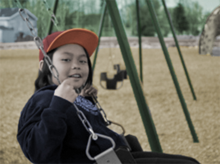
This was a black and white photo of my little brother at the park and in this photo I liked how I used a shallower depth of field to make my brother stand out. In Photoshop I used quick selection tool, brush tool, and quick mask to make selections of the skin, clothing, park, house. and the sky. In the photo used I applied modes such as color, overlay, and opacity to blend the colors for a more realistic look.
- Contrast: There is some contrast seen with the subject and the surrounds as with the black jacket and the lighter wood chips.
- Alignment: The subject is following the rule of thirds and is postioned to the left towards the top leaving some space.
- Repetition: In the background we can see the use of the swings and the color green.
- Proximity: The positions allows the image to capture a scene of a park an swings are in close relation.
- Color: I chose colors that would fit with what the original should of looked like. Lots of greens.
- Layer Effects: Added Adjustments such as Brightness and Hue/Saturation to the image.
- Selection Tool: Selected all the needed areas that needed color.
- Fill Tool: Selected all the needed areas that needed color and Filled them with colors that matched the setting.
Exhibit 3: USU Stars Digital Display
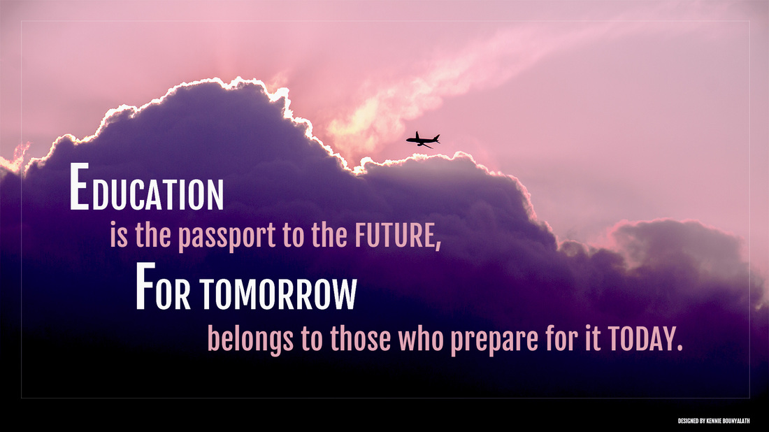
I wanted to focus on the high school students in USU Gear UP.
- Contrast: I used some contrast to distinguish the clouds and the sky. I separated the text using a lighter color to stand out more.
- Alignment: I used a left alignment. The clouds and plane are along the top line in the rule of thirds. I arranged text in a staircase like way and makes text look interesting in my opinion.
- Repetition: I used a repetition of colors such as pink, purple, and white, fonts used were Libre Baskerville throughout. I used aligned the text as well in a pattern staircase.
- Proximity: The text is in close proximity to the clouds and plane.
- Color: I chose colors that matched the stock image.
- Text Tool: Chose a Myriad Pro font and chose to right align text.
- Layer Effects: Realigned layers and added Adjustments such as Brightness and Hue/Saturation to the image.
- Shape Tool: Created a rectangle and turned down the opacity.
Credits
Fonts Used: Myriad Pro
Exhibit 5
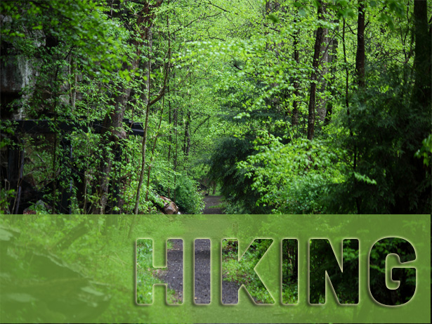
In this design I wanted to incorporate one of my favorite activities, hiking, in this design I used a photo of a hiking trail and used my camera raw skills to sharpen and add saturation to make the image greener. I also wanted to add text to the image and used a clipping mask to emphasize the concept of hiking.
Credits
Fonts: Fajlla One
- Contrast: I used contrast in the text by putting a drop shadow and black stroke around the text to stand apart from the image. .
- Alignment: I chose to right align the text and place it in the right corner to read better. .
- Repetition: I used the colors and leaves and trees throughout. I made the text blend with the background and made green the main color.
- Proximity: I put the text on the trail and open space towards the top.
- Color: I chose colors that matched the stock image.
- Text Tool: Chose a Fajlla One font and chose to right align text to the image
- Layer Effects: Added effects to the text: Outer Glow to be legible and added a Drop Shadow to stand out more.
- Clipping Mask: Created a mask of the image for a see-through effect.
- Shape Tool: Created a rectangle and turned down the opacity.
Credits
Fonts: Fajlla One
Exhibit 6: Informative Poster
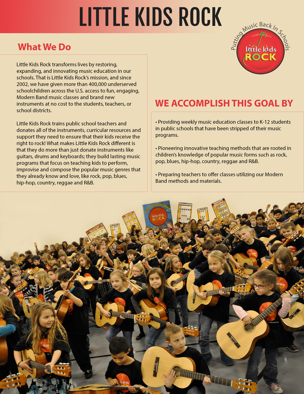
In this design I chose to create a poster for a great cause that inspires me, “Little Kids Rock.” So what I initially did was take an image of the kids with guitars that showed their passion, and I added text and my own design around that image. I wanted to make this poster informative of the cause and attract viewers’ attention.
Credits
Fonts: Myriad Pro
- Contrast: I used contrast in the text by making the colors of the text legible and stand out from one another.
- Alignment: I chose to left align the text and align them towards the top center, and in the empty space of the image.
- Repetition: I used the colors in the stock image. The colors of red, tan-salmon color, and black were used throughout. I used squares to create repetition as well.
- Proximity: I put the text next to the image to show a relationship and the importance.
- Color: I chose colors that matched the stock image. I used red, tan-salmon color, and black.
- Text Tool: I varied the use of type and contained type within boxes
- Type on Path Tool: I curved the type along the logo and create a slogan.
- Gradient Tool: Created a gradient to contain the title of the poster at the top.
- Shape Tool: Created a rectangle around the text to add repetition. Used tool to create a large space top of the image.
- Brush Tool: I used the tool to cover up some of the image to blend with the background color.
Credits
Fonts: Myriad Pro
Exhibit 7: Business Card
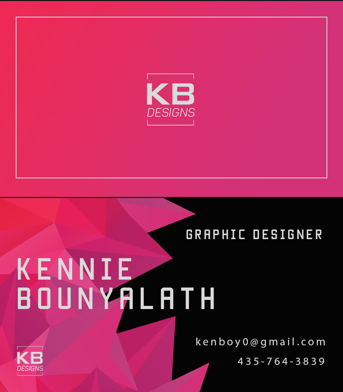
My thoughts about the design of this image...
I wanted an abstract form of something geometric that took up the space on the left side of the canvas. I chose a shape that I could form to my liking and had good colors. I decided to placed my name over the image because I felt it looked right. I chose to use the fonts Menteka for most of the larger type and chose to go with a Myriad Pro for the smaller type. I chose to align the type with the spaces given from the image . In the back of the card I added a gradient to have the same color repetition with the image on the front of the card. .
How I created this image in Photoshop
I first created a logo on the back and transformed it to size in the center. I created a rectangle around it because it looked good. I added a gradient to the back to go with the image I was using. On the front I typed my name, using Manteka font, and placed it over the image. I then typed the text in the upper and lower right corners, re-sized the font , and then changed the personal information to a Myriad Pro font because it look good. I also decided to add the logo back on the lower left corner to relate with the back.
Credits
Fonts: Manteka and Myriad Pro
I wanted an abstract form of something geometric that took up the space on the left side of the canvas. I chose a shape that I could form to my liking and had good colors. I decided to placed my name over the image because I felt it looked right. I chose to use the fonts Menteka for most of the larger type and chose to go with a Myriad Pro for the smaller type. I chose to align the type with the spaces given from the image . In the back of the card I added a gradient to have the same color repetition with the image on the front of the card. .
- Contrast: A light color text on a black background.
- Repetition: Use of color on front and back. The Manteka font is repeated in the logo and text.
- Alignment: Most text right aligned and then name is large and left aligned.
- Proximity: The personal information is in close proximity. The personal information and other text is separated by space, and kept in close proximity to each other.
How I created this image in Photoshop
I first created a logo on the back and transformed it to size in the center. I created a rectangle around it because it looked good. I added a gradient to the back to go with the image I was using. On the front I typed my name, using Manteka font, and placed it over the image. I then typed the text in the upper and lower right corners, re-sized the font , and then changed the personal information to a Myriad Pro font because it look good. I also decided to add the logo back on the lower left corner to relate with the back.
Credits
Fonts: Manteka and Myriad Pro
Exhibit 9: Retouching a Photo
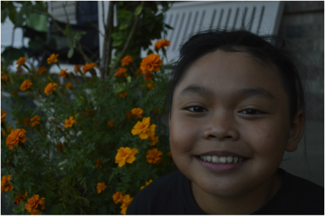
Before
|
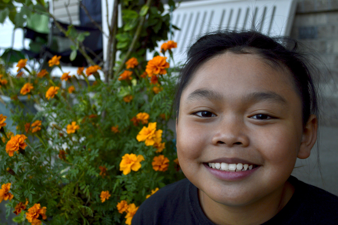
After
|
The image I chose to retouch is an image of my brother. Firstly, I wanted to fix how dark the image was so I applied some adjustments in Photoshop. I then went and retouched the image with the spot healing tool and removed some facial details. I then wanted to make the teeth slightly whiter and applied a fill and applied adjustments to that layer as well. The end result of the image overall I am happy with and is a major improvement from the original image. .
Tools I used to retouched this image in Photoshop
I first used a a curves adjustment to balance out the colors and lights in the image.I then applied a exposure adjustment to bring up the lights in the image. I also added a saturation adjustment to make the colors pop more. I used the selection tool to select the teeth and filled it with white and used the curve adjustments to make the colors blend. I also used the spot healing tool to fix some marks on the face and make it look better.
- Contrast: Darker colors of the subject with the lighter colors of the background.
- Repetition: No actual repetition going on. The use of the flowers in the background.
- Alignment: The subject is following rules of thirds and in the top-right corner.
- Proximity: With the space open on the left lets the flowers interact with the subject.
Tools I used to retouched this image in Photoshop
I first used a a curves adjustment to balance out the colors and lights in the image.I then applied a exposure adjustment to bring up the lights in the image. I also added a saturation adjustment to make the colors pop more. I used the selection tool to select the teeth and filled it with white and used the curve adjustments to make the colors blend. I also used the spot healing tool to fix some marks on the face and make it look better.
Exhibit 10
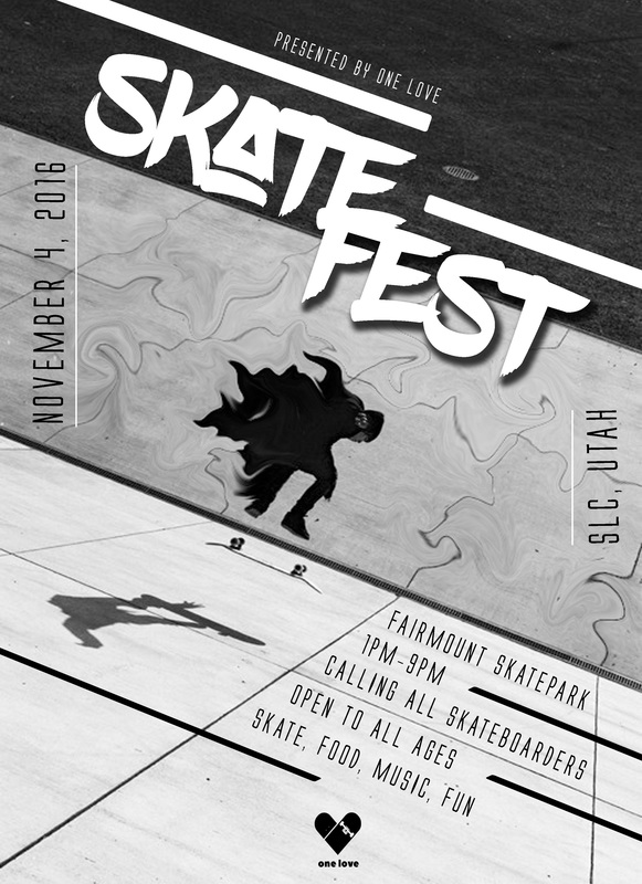
My thoughts about the design of this image...
I wanted an abstract image of skateboarding, so I chose this one and decided to edit it in Photoshop. I chose an image that had interesting angles and lines. I wanted to put the type on different angles and play with the directional lines of the image. I wanted an image that was monochromatic and felt appealing to skateboarders. I decide to make up my own event for my poster design and include elements that made it feel modern and relate to skaters. I chose to use the fonts Blowbrush for the larger type and chose to go with a Alien League font for the subtext. I chose to align the type with the spaces given from the image.
Overall I am pleased with the design and overall result of this poster.
How I created this image in Photoshop
I first created chose the image and used liquify in Photoshop. I then chose a font that would go with the skater theme and align the text with the directional lines with in the image. I then created lines and put some repetition within the design. I decided to use the move tools and transform tool such as rotate to position my type in the places I wanted them to be. I got a logo and made the poster look more official and positioned it on the lower center of the poster.
Credits
Fonts: Blowbrush and Alien League
https://www.pinterest.com/pin/258182991117834629/
I wanted an abstract image of skateboarding, so I chose this one and decided to edit it in Photoshop. I chose an image that had interesting angles and lines. I wanted to put the type on different angles and play with the directional lines of the image. I wanted an image that was monochromatic and felt appealing to skateboarders. I decide to make up my own event for my poster design and include elements that made it feel modern and relate to skaters. I chose to use the fonts Blowbrush for the larger type and chose to go with a Alien League font for the subtext. I chose to align the type with the spaces given from the image.
Overall I am pleased with the design and overall result of this poster.
- Contrast: Area of dark I put white text and areas of white I put black type.
- Repetition: Use of black and white with the image and text. The Alien League font is repeated in the text. I also lines with in the header and subtext of poster
- Alignment: The title of poster is centered in the middle of poster. the subtext is left aligned the bottom of poster.
- Proximity: The title of the poster is set close to the image of the skater and the text is aligned on the wall and close to the skater in the center.
How I created this image in Photoshop
I first created chose the image and used liquify in Photoshop. I then chose a font that would go with the skater theme and align the text with the directional lines with in the image. I then created lines and put some repetition within the design. I decided to use the move tools and transform tool such as rotate to position my type in the places I wanted them to be. I got a logo and made the poster look more official and positioned it on the lower center of the poster.
Credits
Fonts: Blowbrush and Alien League
https://www.pinterest.com/pin/258182991117834629/
Exhibit 12
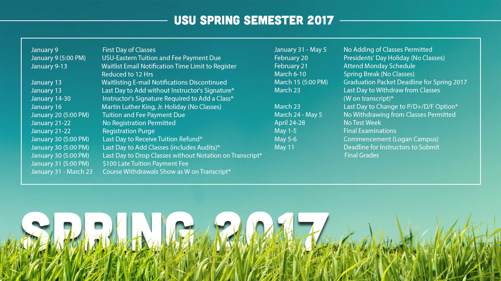
My thoughts about the design of this image...
I wanted to make a schedule that felt like spring, so I chose this image of blue skies and grass. I chose an image that had setting and where I could place type. I wanted to make some sort of element peek out of the grass so I did for the heading of "Spring 2017". I wanted a colorful image that was bright and attract attention with students. I made a layout that was easily readable and could be seen and a further distances for students. I chose to use the fonts Cubano font for the larger type and chose to go with a Myriad Pro font for the subtext. I contained the text in a rectangle as well for viewers to read it easier. Overall I am pleased with the design.
How I created this image in Photoshop
I first created chose the image and then chose a font that was bold and stood out. I chose to make the title interact with the image, so I added a grass layer over text as if the text was coming out of the grass.I then chose to contain the information in a rectangle for readability purposes. I then created lines and put some repetition within the design. I then put a header for the text in the center top of the design to clarify and information. .
Credits
Fonts: Cubano and Myriad Pro
I wanted to make a schedule that felt like spring, so I chose this image of blue skies and grass. I chose an image that had setting and where I could place type. I wanted to make some sort of element peek out of the grass so I did for the heading of "Spring 2017". I wanted a colorful image that was bright and attract attention with students. I made a layout that was easily readable and could be seen and a further distances for students. I chose to use the fonts Cubano font for the larger type and chose to go with a Myriad Pro font for the subtext. I contained the text in a rectangle as well for viewers to read it easier. Overall I am pleased with the design.
- Contrast: I chose a white type which is readable against the blue background. I applied a drop shadow to the title so it could pop more in the design .
- Repetition: The Cubano font is repeated in the text. I also lines with in the header and subtext of poster
- Alignment: The title of poster is left aligned and the header is centered at the top. the subtext is left aligned in the middle of design.
- Proximity: The title of the design is within the grass and working with the elements. The text are in the center and in the sky as if it were clouds.
How I created this image in Photoshop
I first created chose the image and then chose a font that was bold and stood out. I chose to make the title interact with the image, so I added a grass layer over text as if the text was coming out of the grass.I then chose to contain the information in a rectangle for readability purposes. I then created lines and put some repetition within the design. I then put a header for the text in the center top of the design to clarify and information. .
Credits
Fonts: Cubano and Myriad Pro
Exhibit 14: Styles
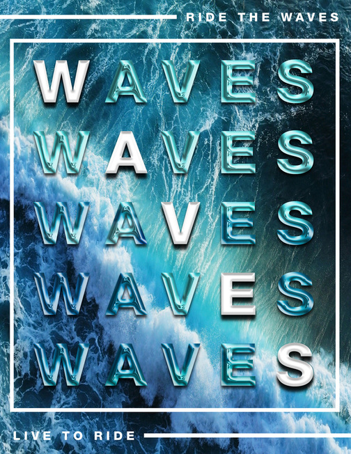
My thoughts about the design of this image...
With the use of styles I wanted to create an image that utilized type with the design. I decided to theme the poster waves and make the colors blue and white its primary colors. Looking at other poster design that inspired me I wanted to use the element of repetition as a main element, so as a main centered image I used the word "WAVES" five times to fill the page and could be read horizontally or diagonally. I wanted to go for a more modern feel and could get the attention of viewer. I wanted to make something creative and interesting and be some what motivational to ride the waves and enjoy life. I contained the text in a rectangle as well for viewers to read it easier. Overall I am pleased with the design.
How I created this image in Photoshop
I first chose the image and then chose a font that stood out. I chose to make the text interact with the image, so I made a style that was blue and looked sort of like the waves. I then chose to contain the information in a rectangle for readability purposes. I then created lines and put some repetition within the design. I decided to place the subtext in opposite direction of each other and to make the design visually balanced.
Credits
Font: Helvetica
With the use of styles I wanted to create an image that utilized type with the design. I decided to theme the poster waves and make the colors blue and white its primary colors. Looking at other poster design that inspired me I wanted to use the element of repetition as a main element, so as a main centered image I used the word "WAVES" five times to fill the page and could be read horizontally or diagonally. I wanted to go for a more modern feel and could get the attention of viewer. I wanted to make something creative and interesting and be some what motivational to ride the waves and enjoy life. I contained the text in a rectangle as well for viewers to read it easier. Overall I am pleased with the design.
- Contrast: I chose a white type which is readable against the blue background. I also wanted to rectangle and lines to be white to stand out from the background.
- Repetition: The Helvetica font is repeated in the text. I repeated the use of the word "WAVES". I used the colors blue and white throughout the style and text.
- Alignment: The center text is just in the waves and the subtext are interacting with the outside waves as well.
- Proximity: The style of the text and subtext are close and working with the elements. The text are in blue and giving a water feel.
How I created this image in Photoshop
I first chose the image and then chose a font that stood out. I chose to make the text interact with the image, so I made a style that was blue and looked sort of like the waves. I then chose to contain the information in a rectangle for readability purposes. I then created lines and put some repetition within the design. I decided to place the subtext in opposite direction of each other and to make the design visually balanced.
Credits
Font: Helvetica
